IntraVUE Analytics
In the IntraVUE main menu are 4 choices - Configure, View, Analyze, and Help. There is basically no documentation on what Analyze does or how to use it. On the WBC-INS web site is a detailed blog article The Benefits of using IntraVUE KPI. This article shows everything you need to know about using KPI Analytics and fixing it to only use events/incidents related to network performance.
IntraVUE Analytics provides an analysis of two statistics available in the IntraVUE database. It calculates Uptime based on Ping Failure percentages.
This is different than WBC Network Health Monitor which bases Uptime of disconnection events because dropping a ping once in a minute without 2 consecutive failed pings (which causes a disconnection event) does not indicate a device is down.
The other statistics is an Intravue Incident. An incident is an event from the event log. Which incidents are counted as an incidents? By default all events except exceeding the ping response time.
See KPI Management for details on fixing which incidents should be used to get meaningful data and how to easily fix this situation.
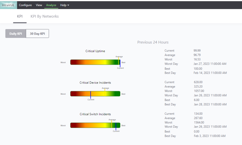
There are 3 main Analytics dialogs. Daily KPI, 30 Day KPI, and KPI By Network. KPI stands for Key Performance Indicator. KPI statistics are recalculated every 2 minutes and is dynamic so if you change which devices are critical or which events count as an incident the chart will use the new information
The Daily KPI chart shows how 'Today' compares to the rolling last 30 days of statistics. The colored bar represents the Best and Worst statistics over the last 30 days. The Yellow vertical bar is the Average statistic for the 30 days and the Blue bar is how Today (the last 24 hours) compares to the last 30 days. The actual data is shown to the right with the dates for the Best and Worst data.

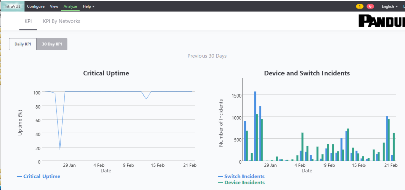
The 30 Day KPI chart shows the calculated Uptime for Critical Always On devices for each day of the 30 days.
It also shows the number of incidents for each day broken down between Switches and Devices.

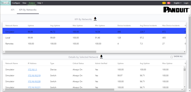
The KPI By Network chart shows summary statistics for each Intravue network. If you select a network in the upper portion, the lower portion shows details by device. Note the Show All checkbox in the bottom header, it allows you to see statistics for every device, not just the Critical Always On devices.

| Introduction |
|
| Key Features and Benefits |
|
| Getting Started |
|
| Update Intravue |
|
| Notes on User Interface |
|
| Configuration |
|
| Connecting to an IntraVUE |
|
| WBC Network Health Monitor Settings |
|
| Email Settings |
|
| Database Settings |
|
| Real-Time IntraVUE Management |
|
| IntraVUE Status |
|
| IntraVUE Dashboard |
|
| Summary Statistics |
|
| Highest Ping Response Devices |
|
| Highest Bandwidth Devices |
|
| Uptime and Statistics |
|
| Hypertree Network Map |
|
| Tree View Network Map |
|
| Reports |
|
| Device Info |
|
| Alarms and Warnings |
|
| Events |
|
| Threshold Analysis and Configuration Report |
|
| Time Based CRC and IfInErrors Report |
|
| Connection History Report |
|
| 1 Week Disconnected Devices Report |
|
| Disconnections by Minute Chart |
|
| Ping Failures by Minute Chart |
|
| Switchprobe (analysis) Reports |
|
| Utilities |
|
| Device Editor |
|
| KPI Management |
|
| Create a 'clean' database with existing ranges |
|
| Vendor Name Management |
|
| DeviceInfo Popup |
|